Showing posts with label OUGD102. Show all posts

Tuesday, 15 February 2011

What is design for screen - The fundamentals of graphic design

The fundamentals of graphic design published by AVA as a chapter about design for screen which gave me a different perspective of design for screen.

Screen designs have different physical considerations from printed design

Technological advances
Devices are getting smaller, as are screen sizes.  So where in the 80's the designer had to cope with a reduced canvas when the CD was introduced over the 12 inch Vinyl album cover, now designers have to think about limiting the number of pixels to a minimum.

As a result the layout, type and image have to work harder to communicate a message.   This has resulted in simplified fonts which are easier to read . 

An example of an APP designed for the IPhone winner of a D&AD award in 2010

Jamie Oliver 20 minute meals


Mobile Marketing / Mobile Applications
Jamie Oliver's 20 Minute Meals
Jamie Oliver and Zolmo teamed up with the objective of inspiring a new generation to cook. The iPhone presented an opportunity to create a completely new format, offering something that a TV show or a recipe book couldn’t. By successfully exploiting the contextual nature,inherent mobility and availability of the device, ‘20 Minute Meals’ put a cooking toolkit in people’s pockets that simply couldn’t have existed a few years ago. An international smash-hit, ‘20 Minute Meals’ has set the bar for cooking apps across mobile platforms.

I have been reading Steven Heller's latest book 'POP- How Graphic Design Shapes Popular Culture' published by Allworth.  He also touches on the challenges designers have faced in designing for a smaller space in the chapter 'Music Design: Think Small'.  He discusses that just in the way designers had to accept the CD packaging as standard following the Album covers demise, designers are now designing for MP3 and online platforms.Excessive typographic detail is now a thing of the past when the MP3 form demands 'simplicity, bold colour, stark image and unadorned type'.  
The new format 240 pixel square has actually led to some innovative solutions. For example by embracing technology Big Active designed The Enemy's album 'We'll live and die in these towns 'by offering an added element.  Each track change brings new track detail on the iPod screen in the format have a Train station departure board.


As I have been researching Collection 100 and think up the 100 product it has occurred to me that the record collectors love of packaging and information is missed with MP3 and iPod.  I think there is potential to develop an APP or attachment with an album which is like an interactive animated album sleeve which the viewer can unfold and open on the touch screen.  In the same way an album cover provided 'more' this cold be an added extra.

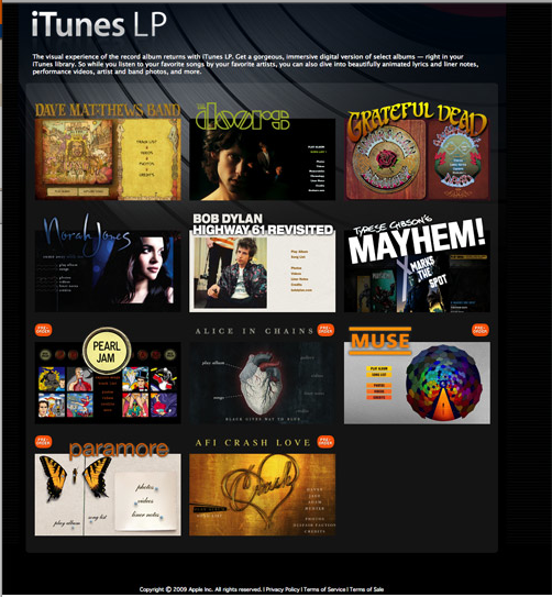
I have found this article IN THE WIRED written in 2008 about this very subject. IPod and IPhone users can actually add interactive album art and features through and App 'ITunes LP 'http://www.apple.com/itunes/lp-and-extras/ on their phone.


Television graphics

Traditionally Graphic design in TV had tended to be limited to the opening and closing credits of movies and programmes. However with the rising popularity of Chanel identification (Idents) with the introduction of MTV  and Channel 4 in the 80's, graphic content has increased.  Technological advances in graphics has led to agencies which specialise in Idents creation eg Imaginary Forces designs film credit for Hollywood.

Technology has also introduced a tool kit to solve some of these problems such as increase choice of colours can be displayed on screens.


An example of a MTV ident


An example of a Channel four ident


What is design for screen? Motion graphics

This motion graphic is visually pleasing to watch however the logo is not very readable.

3d logo

This one works better with a simple readable font yet the overflowing shapes keep your attention.


Print Juice from Victor Ruiz on Vimeo.

This is a good example of just using different typefaces to give a simple but effective message.  Particularly like the sound effects.  A messsage to start the New year on a postive note.  With my Moving image piece the focus was on the image and sound not the type however after seeling this I can image how I could have been more adventurous with the type.
                                        

Drive every drop campaign from Honda.  To appeal to the 'environmentally friendly' and economical audience with the earth association.  Simple visual with the drop turning into the earth.


What is design for screen? Animation

Since attending the Moving image workshop the way I view animation has totally changed.  I can now appreciate the amount of time it takes to create even a small sequence. V WATER [viral animation] on the Behance Network
The animation from Behance  is really clever and reminds me of Take Hart, a programme I used to watch in the late 70's.

This animation is an advertising campaign for Coop Bank, quite different to the one above.  They have used paper folding and money to great effect: 


What is design for screen? Augmented reality

Augmented reality (AR) is a term for a live direct or a indirect view of a physical, real-world environment whose elements are augmented by computer-generated sensory input, such as sound or graphics. It is related to a more general concept called mediated reality, in which a view of reality is modified (possibly even diminished rather than augmented) by a computer. As a result, the technology functions by enhancing one’s current perception of reality. By contrast, virtual reality replaces the real-world with a simulated one.


I found an example of this on the D&AD professional awards


Digital Advertising / Banners & Pop Ups
Augmented Reality Banner
The King loves tech but loathes printers, so when it came to Burger King using augmented reality, it had to be simple. Without using printouts, banner viewers could see a regular dollar bill turn into BK value menu items right in front of their eyes, just by using their webcams. Using facial recognition, users were then turned into the King himself. This was a tastyaugmented reality experience all within a BK banner, something that’s never been done before.
An example of how this works from Youtube


A completely new concept for me.  Really effective as it engages with a certain audience and also has the potential to become viral and spread.  

Digital Advertising / Art Direction
Recode | Decode
Saint was asked by the V&A to promote ‘Decode’, the museum’s first exhibition dedicated to digital art. Traditional art is normally created to affect you, while digital art is best when affected by you. We wanted this inclusive philosophy to extend beyond the exhibition, so we created an open-source campaign that encouraged people to recode ‘Decode’. We worked with digital artist Karsten Schmidt to create an interactive art application that invited people to create their own digital masterpieces. The best recodes were used to promote ‘Decode’ in an integrated campaign that blurred the lines between product and promotion, and helped attract over 235%of original footfall targets.


Credits

  • Art Director
    David Gamble
    Rodrigo Lebrun
  • Creative Director
    David Gamble
  • Copywriter
    Rajeev Basu
    Peter Brown
  • Flash Programmer
    Ali Kember
    Nick Watton
  • Designer
    Dave Price
    Shaban Siddiq
    Sharon Chong
  • Developer
    John Cleveley
  • Digital artist
    Karsten Schmidt
  • Design Agency
    Saint @ RKCR
  • Project Director
    Chris Jefford
  • Project Manager
    Ellen Chng
  • Planning Director
    Mark Sng
I have listed the credits to demonstrate what a huge diverse team is needed to develop a Digital Design project such as this.


There is an art gallery of Digital designs of people who have interacted with this promotion, making art available to the wider general public.  However this type of promotion relies on perhaps a younger more technically minded audience.  The gallery was displayed on the London Underground so in this way it reached a wider audience.  This tool was used for promotion, education and to engage.


Saturday, 12 February 2011

What is design for screen? Digital advertising

As a starting point for this I looked at the D&DA professional awards.  The first that I clicked on was an Ikea campaign for the new Malmo store designed by Advertising Agency Forsman & Bodenfors. An inspired use of Facebook! 
"To advertise the opening of the new IKEA Malmö store we created a Facebook profile for the store manager Gordon Gustavsson and uploaded 12 showroom pictures to his photo album. The first person to tag their name to a product in the picture won it. All pictures reached the limit of 30 tags per photo within minutes of being posted. This resulted in the pictures reaching thousands of people through Facebook’s newsfeed function. When users looked at the photo and read the comments they became aware of the competition, and of course, they also gotto see how beautiful their homes could be if they went to IKEA."


The link to the video explaining the concept is here.  This was clever as it not only engaged by offering an incentive (the prize) but they had a 'sitting' target audience in mind.  Also by keeping the profile on Facebook real people were more likely to hook into the whole concept.


Below is another fantastic IDEA and HOOK.  So Graphic Design is very much about creating unique IDEAS and HOOKS. This campaign attracted applications from 34,684 people from 197 countires and it all started with a simple job advert.  This is the campaign created by Creative Directors James Burchill and Nancy Hartley.  They managed to create a Global phenonmem which resulted in the whole world's eyes on Queensland (unfortunately this would have been a disaster after the current news with all the flooding -Timing is everything!).  The whole concept also relied on the fascination people have with reality TV as the competition and winner was televised. The Best Job in the World


The next camapign concept is new to me given my only sporadic use of Facebook - I had no idea companies/films were designing digital games to advertise their products!  This game was called 221B, was to advertise the new Sherlock Holmes movie.  They even put a code in the closing credits of the film to ensure those hooked on their game went to the cinema asap to get the code.  Again this was targeting a specific Facebook age group audience. Biggest Boxing Day opening in history. 221B

Monday, 7 February 2011

What is design for screen? Website design

Over the last five weeks my research has led me to many websites, a lot are blog based or linked.  I think the purpose of a blog is to engage, inform and also interact almost in 'realtime'.  The best examples of these websites are updated regularly, daily in some cases and have a wide variety of contact not just Graphic Design.  A good example of this is graphic designer Kate Moross 


The home page is very simple and easy to navigate  - Work, play, shop.  I like the white page and plain fonts used as it allows Kates work to speak for itself.  A lot of her work is heavily illustrated with lots of colour.  This website is not only to inform clients about her work, it is also an ongoing portfolio and links to her blog.

Forms website is similar in terms of content however the website is much brighter, promoting their latest work for the rebranding of clothing brand Lettuce.
FormI can't decide whether this is a mistake or not as this sets the scene for the feel of the Agency straight away.  Although this is represenatative of their work, is it not misleading in terms of actually repesenting their client's brand? 


The Design Observer home page in contrast to the simplicity of the websites above is very busy.  It actually put me off wanting to look further as there was too much information.  It felt like the several pages of a magazine all welded together. 


On further investigation I discovered it works like a blog in terms of news is updated regularly and this can be commented on.  I think this type of wbsite would be used by Design professionals and students for information and education.  As such the advanced search button is essential as otherwise a difficult site to navigate.  On reflection I realised actually did dip into an article written by Rick Poyner who had reviewed Reason's to be cheerful..  I had 'stumbled' upon the website by accident via a Google search.

My favourite interactive website, a design agency called Magnetic North has to get another mention here.  On entering the website you faced with a blank white screen which says draw here:


By drawing on the screen different projects that Magnetic North have managed appear:


To see more details of the project the picture is double clicked.  A client can just click a button at the bottom of the screen if they wish to see the latest work or contact Magentic North. Love to know how to create this effect.


Saturday, 15 January 2011

What is design for screen? Like this work - Extraoomp

The work of Linda Zacks..  I found this website simply when I was researching artists who use links in their work for ideas for the collection 100. Linda Zacks was quoted as being fascinated about the links between people.  I really like the 'raw' feel to this work with her use of collage, found objects, illustration and colour. Her website is also as colourful and interactive.


The fantastic cover picture immediately draws you in and makes you want to investigate further.  I like the fact the website is easy to navigate visually in terms of the fact you can just scroll through images of her work immediately without going through loads of menus. Conversely her work is categorised by editorial, typography etc


Monday, 6 December 2010

Module briefing - Design process & what is research?

Design process is:

Research and investigation
Defining your own problems
Not about one fantastic outcome

Reading list:

What is graphic design for? Robinson
Fundamentals of graphic design AVA publishing
Visual research AVA publishing
Mapping
Data flow

Useful advise - The world outside the studio!

What is research?
  • Process is more important than outcome
  • Stimulated - Consciously or sub-consciously search for inspiration
  • Systematic - Controlled eg maps, organising, structuring
  • Gathering data from external sources
  • Collecting Information
  • Talking to people and analysing what people say
  • Asking the question 'What if....?'
Types of research

Primary - Information that does not exist yet eg questionnaires, photographs, personal usually generated to help solve a specific problem

Secondary - Information already exists gathered for some other purpose

Quantitative - This consists of facts, figures and measurements which can then be analysed. Measurable data can be gathered from a variety of sources but it is the interpretation, manipulation and relationships of this data which is important. It is objective and relies on surveys, questionnaires, statistics etc.
Qualitative -Focuses on peoples beliefs, opinions, interactions and experiences to gather information. This can be derived from interviews, focus groups, documentary analysis etc. Qualitative research is not statistical but gives a real-life account on a particular study or event.
The research we had done for the what if project can be categorised as follows/;
Primary
Qualitative
We are weak in this area other than Charlotte had done a questionnaire asking people how they felt about Leeds having more CCTV camera than New York

Quantitative
We counted the number of CCTV cameras on Briggate

Secondary
Qualitative
  • we have gathered news reports and opinions on CCTV.  Celebrity opinion such as Banksy
QuantitativeThe average cost for the installation of a single CCTV camera system costs in the region of £22,500 (Capital) and on average continuous annual revenue costs are £4,500 per year
  • The cost of running the CCTV service is around 1.5 million annually

Sunday, 5 December 2010

You tube CCTV protests/ Leeds live

Who is watching the watchers?

Thought provoking footage of a camerman being asked not to film in Victoria station even though CCTV cameras are all over the station....

DID YOU KNOW YOU CAN ACTUALLY LOOK ON CCTV CAMERAS AROUND LEEDS LIVE!

http://www.leedstravel.info/cdmf-webserver/jsp/livecctv_new.jsp

What if ...fonts

Transport is the main lettering used on British road signs, designed specifically for this purpose by Jock Kinneir and Margaret Calvert. Transport Medium is the lighter variant, which is composed of narrower strokes and used for light text on a dark background.


This is the heavier version of Transport, intended for use with dark text on a lighter background.

Also thought about different imagery which signified looking up such as binoculars. eyes,


Tuesday, 30 November 2010

CCTV images/symbols


And if you don’t believe it really is him, he was filmed making the cover of this magazine, so you can see Banksy at work on the internet: a first. CCTV cameras are one of his obsessions at the moment; they are, he says, one of the worst things about modern Britain.
“The amount of security cameras gets on my nerves. Obviously from a professional point of view, but also on a more philosophical level. I don’t understand why Britain has embraced cameras more than anywhere else — is it because we’re desperate to feel we still matter and we quite enjoy the idea someone is always watching us? I hate it when they say, ‘If you’ve done nothing wrong then you’ve got nothing to hide.’ Everyone’s got something to hide, otherwise there’s something really wrong with them.”


CCTV in Leeds

Leeds Initiative
The objectives of the Leedswatch scheme are:
To reduce the ‘fear of crime’ and offer ‘ reassurance’ to the public, by:(1) Facilitating the apprehension and prosecution of offenders.
(2) Assisting in the prevention and detection of crime committed in public areas.
To achieve the above objectives, the main function and responsibilities of the CCTV operators are to:
(a) Work a shift pattern that provides the monitoring of Leedswatch CCTV on a 24 hour basis.
(b) Respond to incidents and report to the police & other agencies when necessary.
(c) Provide statements for Court purposes.
(d) Act as professional witnesses.
(e) Keep accurate records of incidents.


The cost of running the CCTV service is around 1.5 million annually

A CCTV operator has received a national award for helping to save a woman’s life after she collapsed in January’s heavy snow.

Street marshals are employed by the clubs and bars in the city centre to keep the area safe outside their own premises.

They deal with rowdy behaviour as it arises by:


  • warning troublemakers about their behaviour
  • liaising with other clubs to ban entry for specific people
  • getting city centre CCTV cameras trained on troublesome groups or individuals
  • contacting the police when necessary
I dont think leeds city centre is as bad as it was 10 or 20 years this is mainly down to the diverse nightlife and choice of venue
But it could be better a lot better and the major factor in that is policing and by this i dont mean the plague of cctv which is great at filming crime but does little to prevent it. Walking the beat seems to be a thing of the past and should be more of a priority its become like a lost art. leedsleader said at 2010-10-27 15:14:51

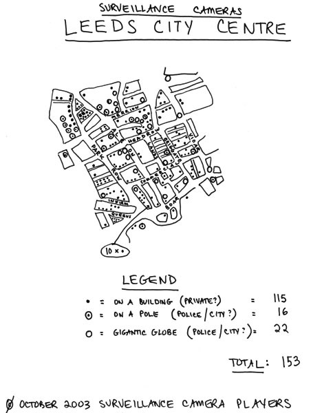
New York Surveilance Players ' As the final version of his map indicates, this rather small, densely packed area is watched by a total of (at least) 153 cameras: 115 installed on the exteriors of privately owned buildings, and most likely operated by private security guards; 22 hidden within uncommonly large, black-tinted globes, and most likely operated by the police; and 16 installed atop poles, and definitely operated by the City Council.'

FOI Request Reveals Councils Have Spent £315 Million On CCTVs In Last 3 years - LGA Defends Councils Decision On CCTVs

 Leeds with £3.9 Million

Big Brother Watch   

Leeds - 

Trying to provide a positive slant on Surveillance cammeras:


http://www.yorkshirepost.co.uk/features/Watching-them-watching-you-.5965866.jp


From Council report
'CCTV is an emotive issue; however the public of Leeds, on the whole, are
supportive of the Council’s use of this technology to reduce crime and the fear
of crime. The cameras have a proven track record as a key strategy in crime
prevention and detection and allaying the fear of crime.'

The average cost for the installation of a single CCTV camera system costs in
the region of £22,500 (Capital) and on average continuous annual revenue
costs are £4,500 per year. Annual revenue costs cover the cost of the BT line
rental, electrics, monitoring and maintenance of the system, but do not include
any insurance for damage to the system e.g. motor vehicle collision or
vandalism.


Another website with the same idea!

http://mapcams.org/contribute


385  cameras 715402 (2001 pop)  0.5 cameras per 1000