Friday, 15 October 2010

Alphabet soup 2 -further research

I explored the adjectives by considering the definitions:

Additional adjectives which influenced my direction were from STRONG -  Solid, Distictive, ANGULAR

Confident - BOLD

Ambitious- SUCCESS

I considered how I could adapt an existing typeface to reflect Lewis'personality:

Elongate,
Shorten
Remove serifs
Double/magnify, make bolder,
Explore negative space
Broaden shoulders
Lengthen
Take ears off
Sharpen corners

I also considered fonts which may appeal to Lewis.

Tuesday, 5 October 2010

Visual language - Sequences

1. Firework sequence


2. Sequence of fruit developing
the development sequence of a nectarine
3. Sunrise


4.
Surfer sequence
5. Aircraft landing procedure
R

Monday, 4 October 2010

Alphabet soup 2 - initial research


The five adjectives I used to describe my font partner, Lewis were:

Confident
Laid back
Ambitious
Gadget king
Strong

He prefers sans serif simple fonts such as helvetica, gill sans and frutiger.  Although he likes tall thin fonts he also likes quite stylized chunky fonts.  He dislikes script, gothic and rosewood.

I read with interest that since 2001 Apple have used a sans serif typeface called Myriad pro in all their marketing.  The most recent ifones use Helvetica!  I am not sure whether Lewis's font preference's are by accident or because of his love of gadgets specifically is Apple ifone.

Sunday, 3 October 2010

What is Graphic Design?

To start somwhere, I started at the end.... or rather where a lot of good (& Bad) Graphic Design is today... On websites.  When I was researching which Uni/college to attend I stumbled across this fantastic website....

Magnetic north


I love the interactive nature of the design which goes beyond pressing buttons.  As a potential client you get to explore the site by drawing either circles or lines to move around the news. It is both fun and informative. I like the name Magnetic North as it immediately draws you to it yet states it is based in the north not London.

Friday, 1 October 2010

Definition of knit and my interpretation


       Definition of knit


  1.      
              to make something such as a piece of clothing using wool and sticks called knitting needles


  2.  or 

    knit together


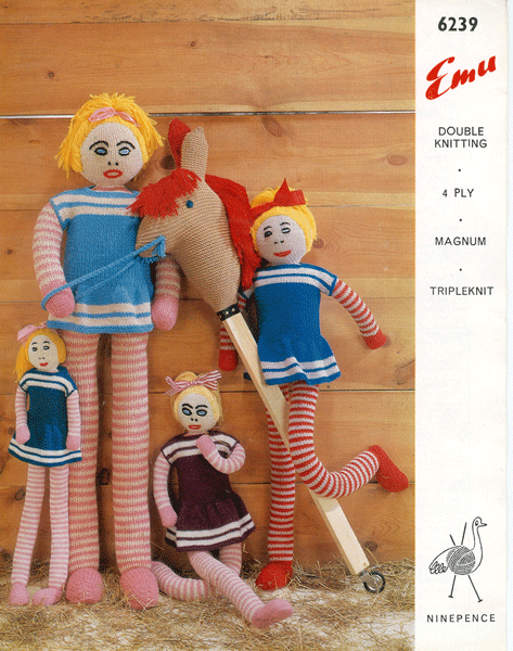
    The word knit immediately conjured up images of my granny who taught me how to knit and used to knit me dolls and clothes.  I initially went down this road and and researched 'knit' images and old knitting patterns online.
  3. Words that came to mind were jumpers, wool yarn, wool unravelling, pattern, loops, knitting needles, knitting pattern, knit one, pearl one, cast on, cast off .  

    The loop shapes lead me to google 'loop' fonts online.  A lot of script fonts have 'loops'.  such as 'Scriptina pro' and Kunster script. from the group work we did trying to group a letter the letter K had grabbed me and also the obvious link to 'knit'

  4. So I manipulated the letter k and the word K in photoshop examples of which are in my Design Practice blog. 


Monday, 27 September 2010

Alphabet soup - initial research

Links I found connected between the word 'Knit' and typography:

Wooled on Behance

Like the natural organic feel
Fun-knitting on Behance


There logo is very 'loopy' and evokes the impression of string or wool

Research free flowing, 'loopy' fonts...maybe script
Identifont.com/Lonely Sandwich
Can see letters V,W,M,A,

Can see n,o,u,w,m,


Knit=yarn
Knit=wool= Sheep


Thursday, 23 September 2010

How to... research inforgraphics

The topic grabbed me as much as the graphics...  the Colors of the Web

Fantastic colours ...


Like the gas hob..instantly communicates, like the childs windmill