Sunday, 16 October 2011

Seven things to know about print

These notes are based on a seminar by Lorenzo and supplemented by research in Getting it right in print by Mark Gatter and The Visual dictionary of pre-pass & production published by ava.


1. Colour models CMYK, RGB, Hexachrome, spot colour, PMS pantone matching systems


2. Formats  - Standard ISO paper sizes
              - A & RSA sizes - Printers work to slightly larger sized paper (12mm)to accommodate bleed
              - Imperial(US) V Metric(Europe/ROW)
              - Tabloid, Broadsheet, Berliner
              - Envelope 'C' sizes
              - DL sizes - third a4 (Standard envelope

3. Artwork - Clients signs off proof
 Document set up, file formats, fonts(Check copyright or commercial use of fonts), Spellcheck, Colour spec, print marks, pre-flight check, Mockups and proofs

4. Stocks -  Weights (GSM - grams per sq. metre)
          -  Finish - Gloss, silk, matt, coated, uncoated
          -  Laid or woven fibres
          -  Boards, cartons
          -  Plastics & acetates
5. Processes - litho, Gravure, flexo  digital, screen or pad 
             - 4, 6 10 colour printing
             - Laminates

6. Finishing - Case binding, Burst binding, Flexi binding, Swiss binding, PVR binding  tougher than perfect binding,        
             - Folding and creasing
             - Die cutting

7. Costs  - three quotes get first stage quote so can provide client with and estimate before investing a lot of time in the design
          - Efficient & economical printing - qties ie <500 digital . > 500 litho?


Colour systems for the print process

These notes represent a summary of a seminar we had with Lorenzo and also with reference to Getting it right in print by Mark Gatter published by Lawrence King


Key aspects of digital colour theory


Understanding the practical use of colour for print production 


                       CMYK V  RGB
 Cyan Magenta Yellow Key    V  Red Green Blue   
                      Print V  Screen
               (Subtractive v  additive)
                    Pigment V  Light  
   Darker the more colour      Brighter the more colours added
       Limited colour Gamut V  Wider colour Gamut 
              Paint & Print V  Monitor, TV


Colour systems


Technical, essential knowledge to control your work


CMYK DEFINITION:

Stands for "Cyan Magenta Yellow Black." These are the four basic colors used for printing color images. Unlike RGB (red, green, blue), which is used for creating images on your computer screen, CMYK colors are "subtractive." This means the colors get darker as you blend them together. Since RGB colors are used for light, not pigments, the colors grow brighter as you blend them or increase their intensity.


RGB

SPOT COLOUR
Print technicians around the world use the term spot colour to mean any colour generated by a non-standard offset ink; such as metallic, fluorescent, spot varnish, or custom hand-mixed inks. (as opposed to obtaining a colour by via mix of cmyk)


Spot colour


GREYSCALE
One colour black and all the shades of grey through to white (black and white photography is grey scale)


Grayscale


MONOCHROME (mono)
Like grayscale but with coloured ink ie one colour and % tints of that colours plus the colour of the material it's printed on.
Monochromatic colours are all the colours of a single hue derived from one colour and extended using the shades,tones and tints of that colour.

Mono


DUOTONE
Duo

When a continuous tone image is printed in 2 or more spot colours. This term is also generally used when describing tri and quad colours.


HALFTONE
This is a mechanical process (as opposed to chemical) for converting tonal values into a series of dots that although solid dots, when printed give the impression of continuous tone. 


Rich Black


richblack_vs_plainblack

Black on screen - 0 R 0 G 0 B


Printing black


plain black/ 100% black ink 0C, 0M, 0Y, 100K 
Rich black - printing other inks along with black. 
Most common 


rich black 63C, 52M, 51Y 100K. 


This particular variant owes it's popularity to Adobe Photoshop - when an RGB file is converted to CMYK, areas that are absolute RGB black (R0, G0, B0) will wind up with this combination, unless certain default settings have been changed. 


Cool Black 60C, 0M, 0Y, 100K 


Warm Black 0C, 60M, 30C, 100K


Important to remember although all black looks the same on screen ie RGB they will not look the same printed out.  Always ensure using a consisitant mix of black throughout a document/image.


The special-purpose color "registration" is another potential source of black mismatches. On screen, by default, it appears as R0, G0, B0, so it seems as if it might be the same as black. It's not. Registration color prints 100% on all plates. If your layout is CMYK, then registration color is 100C, 100M, 100Y, 100K. If your layout is CMYK + Pantone 285, then registration color is 100C, 100M, 100Y, 100K, 100Pantone 285. Registration color is used for, appropriately enough, registration marks, explained elsewhere. Do not use it in place of black. Having that much ink go down presents many problems from a printing standpoint. 


Don't use Rich Black for Text use plain black.  If the printer has registration problems the text could become difficult to read 


Other tips picked up from Lorenzo's links:


For accurate colour matching use Pantone Colours so what you see is what you get rather than trying to match a colour you like on screen.


Check with your printer what type of files they prefer.  PDF is good because they are smaller file sizes than Photoshop or Illustrator.


The Problem
Using the wrong resolution in your works can be detrimental to your final outcome. It is important to know the final destination of your work so that you can design at the correct resolution. Most printers print at about 300dpi (dots per inch), some even at 600dpi or above. The resolution of a monitor is 72ppi (pixels per inch), and is a default setting in Photoshop and Illustrator for RGB design.
A few things to note…
So let’s talk about some basic differences between dpi and ppi, and then decide what is best to use for different projects.
Simply put, pixels are square, dots are… well, dots. They consist of one color. Obviously, the more dots or pixels per inch, the more detailed and accurate your picture will be. It is important to design at 300ppi so that when you print on a 300 dpi printer, each pixel is translated as a dot. It is okay to design at a higher ppi than your printer’s dpi, but be careful designing below 300ppi.
The Fix
Unless you are designing something huge, the magic number for print design is… you guessed it,300dpi. Generally, anything that you can hold in your hands should be designed at or above 300dpi. It is especially important to note that though you can go down in dpi, you cannot go up without quality loss (when working with rasterized elements). Therefore, as long as your processor can handle it, it is best practice to work at 300 dpi or the maximum for your specific printer.
Depending on the size of a particular piece, you may have to design for perspective resolution. In other words, a billboard, from the road, appears to be a couple of inches wide, so therefore the dpi can be much lower (often around 18-20 dpi).  

Saturday, 15 October 2011

Commercial print

This is a summary of a seminar with Lorenzo, a print visit, online research and also referencing The Production Manual and The Visual Dictionary of Pre-press & production published by ava


Commercial print processes


'Printing is  process that applies ink or varnish from a printing plate to a substrate through the application of pressure' The production Manual p152


Commercial printing is practical, technical and economical (or should be!)


Rotary printing


Offset Lithography (Litho)
Planographic
The inked image is transferred or offset from a etched aluminium printing plate onto a rubber blanket roller which is then pressed against the paper or other substrate. Th principle behind Litho relies on the fact that oil and water repel each other. As the plate passes under the ink roller the non-image area of the plate have a water film that repels the oily inks on the image areas.


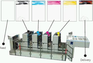
Lithography is generally 4 colour printing CMYK with from 2 up to six spot colours.  Spellman Walker had just purchased a ten colour machine. It can produce a good photographic reproduction and fine linework on a variety of stocks.  The printing plates are easy to prepare, even more so with new technology. The high level of machine preparation and also high speeds means this is more suitable for high volume runs.

Sheet fed printing presses are used for lower production runs such as brochures and magazines whilst a continuous web press is used for higher volumes such as newspapers and magazines.Sheet fed printing presses are typically fed with a 'ream' of paper at a time.  A ream is a block of 500 sheets. Massive rolls of stock are used on web printing stocks rather than sheets.  This means lower production costs can be achieved.  Webs are more commonly used with Rotogravure and flexography.  An advantage of roll fed printing is lighter paper stocks can be used than with sheet fed.  This reduces bulk and weight say in book production which can then mean distribution and packaging costs are cheaper.


Problems 
Very high print runs image quality can suffer due to wear on the plate.
Ink and water balance on the plate can cause problems with colour control and cause colour variation.  
Water can cause absorbent substrates to distort.
Mis-registration caused by mis-aligned printing plates


Examples


Rotogravure (Gravure) 


Intaglio etching. Copper plates(with mirror image) transfer ink directly, not offset, to a print surface, usually on rolls. Advantage , plates are more durable and so are good for long print runs. High volume and good quality so more expensive than litho.


Typical Rotogravure applications


Flexography(Flexo)
"relief' 
Commonly used for packaging for food and sweets with high volume but lower quality printing.  A positive mirror image on a rubber polymer plate with typically 2mm relief transfers sticky ink direct to the surface. usually roll fed.


Examples


'When you purchase plastic roll banners, you also purchase the plates required for printing them. These plates are a pivotal part of the printing process. They are the vehicle through which ink is transferred onto the plastic. Since we print with this flexo technology, every color you use in your design requires its own plate.
Here’s the great news about your plates: once you purchase plates for a design, you’ll never have to purchase them again! This is the truly wonderful thing about plastic roll banners and flexo-printing: your plates can be used and re-used as many times as you want! What’s more is that we will store your plates for free for as long as you would like. NorthCoast Banners is here to serve our clients. We have not forgotten that the customer comes first.

Flexo Print Quality

Originally, flexo printing was very low quality. In the last few decades great advances have been made, including improvements to the plate material and the method of plate creation - usually photographic exposure followed by chemical etch, though also by direct laser engraving. Laser-etched anilox rolls also play a part in the improvement of print quality.
Full color picture printing now occurs, and some of the finer presses available today in combination with a skilled operator allow quality that rivals the lithographic process.
Flexo has an advantage over lithography in that it can use a wider range of inks and is good at printing on a variety of different materials. Flexo inks, unlike those used in lithography generally have low viscosity. This enables faster drying and as a result, faster production, which means low cost.
Our printing presses average speeds of 450 linear feet per minute.'

Read more: http://www.northcoastbanners.com/flexographic-printing-plastic-roll-banners-bags#ixzz1arm5KRxD

Read more: http://blog.northcoastbanners.com/page/2/#ixzz1arlrLnhk


Digital printing


The reproduction of images by translating the digital code directly from a computer to the sheet without intermediate physical process.  No mechanical process, typically short runs or specials of less than 500 copies on a variety of stocks including paper and metal. 


Screen Printing
A printmaking technique that uses a woven mesh to support an ink blocking stencil.  Can be manual and mechanical.  Used for CD printing. Also rotary screen printing for bottles and tubes.


Pad printing


2D image on a 3D object
Examples


Linen tester used to scrutinise print quality as they magnify


Wednesday, 12 October 2011

Stock Options & Print Finishes - Task 3

Samples collected


240gsm vanguard red (black print with foil: Kurz Colorit 932)
Aimed at GD Professionals


 Uncoated /foil.  Luxury understated aimed at Creative Review professionals


Luxury product. UV Varnish on outside, matt on inside.
Spot colours used for vibrant  colour


Satin stock.  Florescent spot colour.  Aimed at Creatives


Generation Press


Colour edging, crisp expensive looking Graphic Design aimed at impressing professionals


Flourescent spot colour - Branding for Nick Bell


Using a range of stocks in real context - Book for GF Smith Colour plan.


Embossing.  Two stocks both aimed at communicating the story through texture


Mega duplexing - luxury invitation


Embossing, foil blocking, selection of colourplan paper. Clever design for the ultimate client the V&A


Gp conquer colour edging in style.  Unique and eye catching branding and promotion


Luxury branding using foil blocking, metallic ink and paper coated one side to make this stand out from the crowd. 


Effective use of two stocks to create a limited edition poster. To appeal to fans and creatives alike.