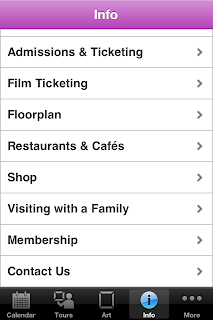
The MOMA in new York have a reasonably clean and simple app Its is very functional however lacks personality.
I found a Graphic Design museum in germany with an App. Again clean and functional
This is messy I am sure they could have designed it simpler. Nice idea though as you can click on exhibits for more info. as you go round.
The explore function was the most interesting design. It displayed all the posters and you skimmed acros them until you clicked n the one that interests you.
The V&A Museum app. Just a simple App to search their collections, nothing more or less. Fits with Museum Branding


No comments:
Post a Comment