
Screen designs have different physical considerations from printed design
Technological advances
Devices are getting smaller, as are screen sizes. So where in the 80's the designer had to cope with a reduced canvas when the CD was introduced over the 12 inch Vinyl album cover, now designers have to think about limiting the number of pixels to a minimum.
As a result the layout, type and image have to work harder to communicate a message. This has resulted in simplified fonts which are easier to read .
An example of an APP designed for the IPhone winner of a D&AD award in 2010
Jamie Oliver 20 minute meals

Mobile Marketing / Mobile Applications
Jamie Oliver's 20 Minute Meals
Jamie Oliver's 20 Minute Meals
I have been reading Steven Heller's latest book 'POP- How Graphic Design Shapes Popular Culture' published by Allworth. He also touches on the challenges designers have faced in designing for a smaller space in the chapter 'Music Design: Think Small'. He discusses that just in the way designers had to accept the CD packaging as standard following the Album covers demise, designers are now designing for MP3 and online platforms.Excessive typographic detail is now a thing of the past when the MP3 form demands 'simplicity, bold colour, stark image and unadorned type'.
The new format 240 pixel square has actually led to some innovative solutions. For example by embracing technology Big Active designed The Enemy's album 'We'll live and die in these towns 'by offering an added element. Each track change brings new track detail on the iPod screen in the format have a Train station departure board.

As I have been researching Collection 100 and think up the 100 product it has occurred to me that the record collectors love of packaging and information is missed with MP3 and iPod. I think there is potential to develop an APP or attachment with an album which is like an interactive animated album sleeve which the viewer can unfold and open on the touch screen. In the same way an album cover provided 'more' this cold be an added extra.
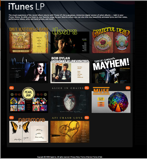
I have found this article IN THE WIRED written in 2008 about this very subject. IPod and IPhone users can actually add interactive album art and features through and App 'ITunes LP 'http://www.apple.com/itunes/lp-and-extras/ on their phone.
Television graphics
Traditionally Graphic design in TV had tended to be limited to the opening and closing credits of movies and programmes. However with the rising popularity of Chanel identification (Idents) with the introduction of MTV and Channel 4 in the 80's, graphic content has increased. Technological advances in graphics has led to agencies which specialise in Idents creation eg Imaginary Forces designs film credit for Hollywood.
Technology has also introduced a tool kit to solve some of these problems such as increase choice of colours can be displayed on screens.
An example of a MTV ident
An example of a Channel four ident
No comments:
Post a Comment