


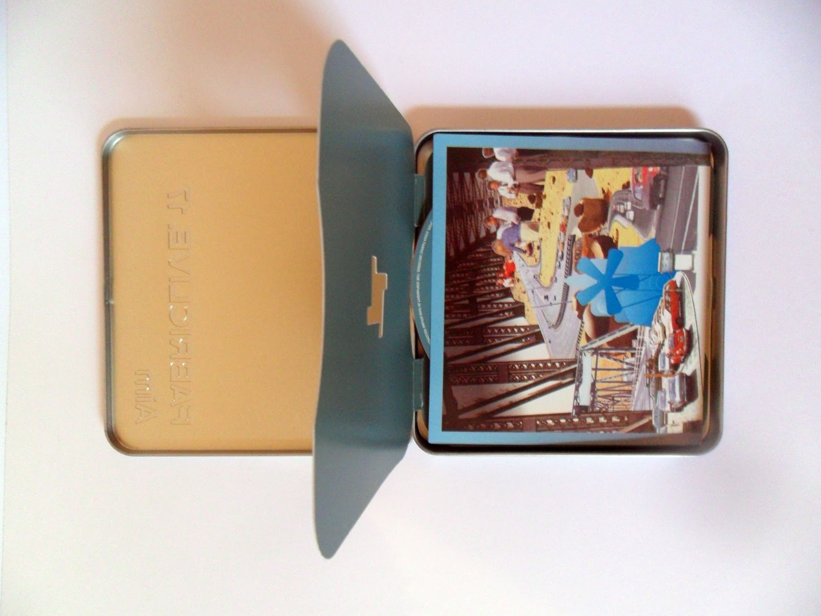
I used this idea for my first test piece. I was nervous about trying to 'cut out' a circle to represent the vinyl neatly. This seemed a 'halfway house and also it gave me a way of housing the DVD neatly.


This was noticable just because of the shape however my husband says it is a pain as it does not fit in with the rest of the CD collection


I love the weight of the stock used for this design it feels luxurious. Also this is a good example of the 'full package' including a really intesting poster. Really strong price of design by Lewis Heriz


This used a mini disc as an added feature

I like the strong orange/black combination.The cut out through the hair is really efefctive and works on the reverse as the centre part of the reel to reel tapes. I also like the bold simplicity of 'spiked' font


This is very tactile with a velvet material finish, feels sumptious


This Sigur Ross feels like a book cover (Which I can envisage making after the Book workshop) The illustrations and cover design by sigur rós, ísak winther, alex somers and lukka sigurðardóttir are exquisite. So much so I have put the link to the other art work here


No comments:
Post a Comment